
4URBAN Promotional Materials

A logo I designed for 4URBAN
The first thing I done for this assignment was read the brief that had been set by the client.
From the brief I found out that I was creating two promotional materials for a new tv channel called 4URBAN, it was targeting 16-21 year olds and was about music, architecture and fashion.
The two promotional materials I chose to design were a poster and a webpage.

A moodboard for the 4URBAN project
This is the moodboard i created for this project. I added images that related to the target audience of what the television channel would be based around, this being music, architecture and fashion.
I had to add many things that were around in the time I was working on this assignment as it was targeted at my age group and they had many similar interests as I did.
tMusic artists such as Drake and Ed Sheeran who were popular amongst 16-21 year olds at the time, clothing brands such as Nike, Champion and Gucci which is what 16-21 year olds were wearing at the time of creation and architecture such as the City of Dubai and the City of London where most 16-21 year olds will know about.


Three initial logos I designed for 4URBAN
The next task was to design 3 initial logo designs using Photoshop. I chose to create one using a very urban type font which i got from dafont.com, i gave it a gold number four and gave the "urban" a burgundy red colour. I believe these two colours portray the word urban as they show a modern look and go well together.
Another logo i designed is one where the name of the TV channel is linked together through the gaps in-between each letter, I chose to put it in purple and blue, alternating on each character on the logo as they go well together. This shows a very modern and urban look which is unusual.
The third logo i designed is one where the number four is large, it has the word urban going vertically on the right of the number. The number is the same height as the word urban. I once again chose to use shades of purple and blue as these colours go well together, on the number 4 the colours overlap each other and on the word urban, i alternate between the shades of purple and blue.

The poster I designed for 4URBAN
I then designed my first promotional material for 4URBAN. The poster was created using Photoshop, i used the gold and burgundy logo and added "TV" under the right side of it which tells the audience that it is a television channel. I created a design using right angled triangles, the colours i chose were blue and purple as these are bright and attract the audience, the design of the poster fits well with this background.
I added three logos, a music disk for music, a t-shirt for fashion and some buildings for architecture, this tells the audience what type of content the television channel will be showing.
Finally i added the date at the bottom of the page, it is in a square box to help it stand out to the audience as they will be looking for when the channel releases.
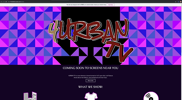
The webiste I designed for 4URBAN
Finally, I designed the second piece of promotional material for 4URBAN, the website. I made the website easy to navigate, showing the logo, info about the channel and a contact form.
I used the same design a banner where the logo is as I used on the poster, I once again used the burgundy and gold logo as the logo for 4URBAN on the website.
Under the logo, I used the quote "coming soon to screens near you" to show that it wasn't far away and will e available to everyone. Under this i gave a little insight into the audience of the television channel (16-21 year olds), i also added a more info button which takes the viewer to a page with more information about the TV channel.
Below this is the three topics of the channel, this will display the shows in this sector and give highlights/replays of them to the audience.
At the bottom of the page is a contact form and the address of the headquarters for 4URBAN.